The Art of Designing for Behavior Change

Images courtesy of Mad*Pow
By Amy Bucher, Ph.D., Vice President of Behavior Change Design, Mad*Pow
Maybe the change is as small as having people consider a new perspective after interacting with an exhibit about a historical event. Maybe it’s a one-time action, like making an appointment for a colonoscopy the week after turning 50 years old after receiving an automated phone call from a health insurance plan. Or it could be an ongoing new behavior, like making a meatless dinner part of the family’s weekly routine with the help of a meal-planning app.
Yet, over and over, designers get focused on more immediate success metrics. How many people are downloading this app? Visiting this website? Interacting with this exhibit? They reach for tools designed to “nudge” users into quick actions, and for some outcomes, those tools are enough.
However, many of the most significant problems designers hope to solve call for more than a one-time action on the part of the people who encounter the design. Take 401k enrollment as an example, where opt-out choice architecture can dramatically increase the percentage of people opening a retirement plan. People who are nudged into opening a plan are likely to invest only at the default level and ultimately save less than people who enroll with a more deliberate set of financial goals.
For the types of behavior change challenges that require people to opt in over and over, a more robust intervention approach is required. Enter motivational design.
Behind the Motivational Curtain
Motivational design leverages the psychology of motivation to craft experiences and products that people are intrinsically interested in using. Understanding the psychological reasons why people engage with some products and experiences and not others helps designers to go beyond thinking about features to consider what function they’re fulfilling for their users, or not. A designer who understands motivation can make better product decisions that are aligned to what actually works for users.
So let’s start with motivation. Motivation always has an object; it’s wanting to do something. When we practice behavior change design, we’re creating the context around that something. We want it to be appealing to people. Not only should our users want the results of engaging with our designs, but they should enjoy the experience of using the products, too. Otherwise, why would they continue long enough to see results?
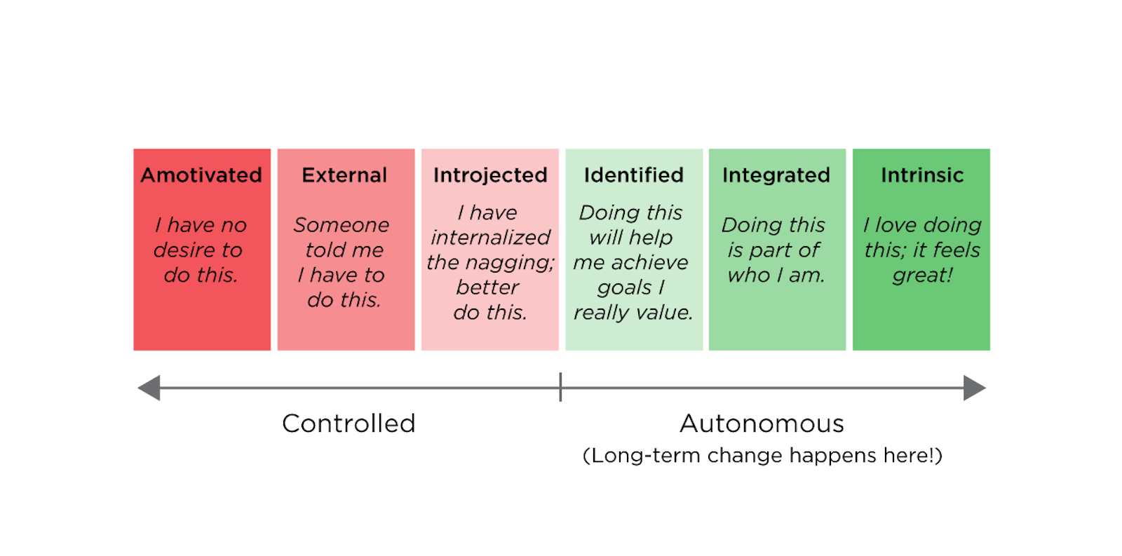
Good motivational design starts from an understanding that not all motivation is created equally. Motivational quality refers to the source of a person’s motivation. As a rule of thumb, the more autonomous, personal, and internal the source of motivation is, the longer lasting and more resilient to obstacles that motivation will be. On the other side of the spectrum, more controlled forms of motivation, originating from outside of the person, are short-lived and unlikely to survive challenges.
The sources of motivation can be arranged in a continuum from most controlled to most autonomous. (1) The controlled forms of motivation include extrinsic motivations like rewards or punishments, which may take the forms of incentives or even scolding, and introjected motivations, which are when the self internalizes expectations from others. This contrasts with identified and integrated motivations, which occur when a behavior aligns with a person’s goals, values, and self-perceptions. People with identified and integrated sources of motivation are interested in doing something because it supports something they already care about. That can be a powerful reason to stick with a behavior.
Intrinsic motivation, of course, is doing something simply for the pleasure of it. Creating experiences that are beautiful and fun helps tap into intrinsic sources of motivation. Psychologists have long known that the human brain is wired to engage with stories; (2) now the emerging field of neuroaesthetics indicates a similar human attraction to visual art. (3) Art’s ability to capture people’s attention is one reason why the science of behavior change relies heavily on it to be successful.
The crux of motivational design is that meaningful sources of motivation have to come from the user, not the designer. The designer can create breadcrumb trails that help users understand how taking a particular course of action will fulfill meaningful goals, express a cherished self-identity, or uphold deeply held values. They can even explicitly make the case that there is common ground between what the product owner and the user hope to achieve, but to actually impose a goal on a user goes directly into controlled motivation territory. I call this the designer’s dilemma. Creating something truly engaging and effective requires ceding control to the user.
Fortunately for us designers, there are principles we can use to align our desired outcomes with what’s meaningful to the people using our products. The trick is to find opportunities to support people’s basic psychological needs of autonomy, competence, and relatedness. If you consider reaching a goal as a journey, then these needs align to letting people map their own course, helping them monitor their progress, and making sure they are not alone on their way.
Mapping the Course
The basic psychological need of autonomy involves people’s innate desire for some control over their own destinies. Designers can approach this by being selective about which choices they offer users. As much as possible, important choices should be delegated to users and less consequential ones can be presented as modifiable defaults. When minor choices are left to users, designers should architect the experience to make the process swift and easy.
Meaningful Choices
The word “meaningful” is deliberately chosen here. Choice per se does not fill people’s need for autonomy. In fact, a high volume of low consequence choices can be distracting and annoying. Imagine if you had to choose every setting on a brand new smartphone, from background color to font choice to default battery usage, rather than being able to use factory defaults.
What really drives motivation is big picture choices, things like specifying your goals for participating in a program. Noom, a weight management app, does a particularly nice job of helping its users articulate what’s really important to them as part of the program onboarding. By leading users through a series of prompts and getting them to think about why their health really matters to them, Noom likely boosts their motivational quality, and by extension, their ability to reach weight loss goals.
A simple tool in every designer’s toolkit that can bring meaningful choice into the experience is posing questions to the user, without necessarily needing to collect their responses. Regardless of how technologically sophisticated your design is, you can include prompts in the experience for people to reflect on what’s important to them and affect how they orient themselves with respect to what you’ve designed.
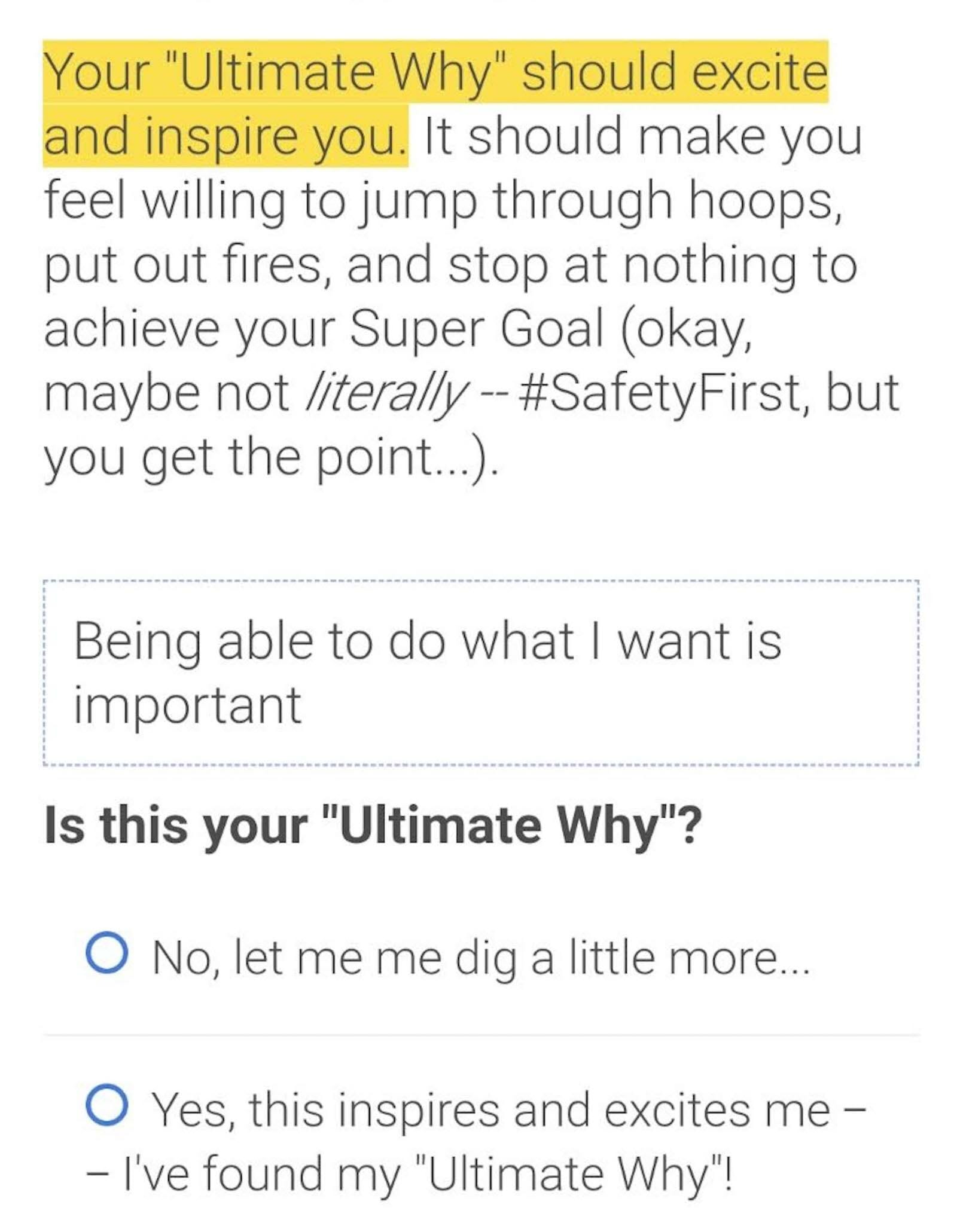
This screengrab shows one of the prompts that Noom users see when using the app.
Making Choices Easier
If you’ve ever used Netflix, you’ve likely spent far longer than you wanted to browsing alternatives without deciding what to watch. You may have even decided not to watch TV after all. There’s simultaneously nothing on and so much stuff. This type of decision fatigue that occurs when people are bombarded with too many choices is what designers can avoid with elegant choice architecture.
Want to make choices easier? Think in terms of constrained or curated choices. How can you offer people fewer but higher quality choices? This is what recommendation engines such as the ones used by Netflix, Spotify, and Amazon attempt to do, with mixed success. While Netflix offers a huge number of suggestions, it does at least narrow down the universe of entertainment for subscribers. Even better is how Amazon suggests just two or three other items that are “frequently bought together.” A shorter options list can be perceived as more targeted, and is less likely to overwhelm users.
Getting recommendation engines right really matters when they’re being used to help people make consequential decisions, like in healthcare or finance. For example, Roobrik is a tool to help caregivers make decisions about what services to seek for their loved ones. It uses inputs from users to make recommendations among options. One thing Roobrik does explicitly is expose why a particular recommendation was made. This helps reassure users that the options they’re considering are truly right for them.
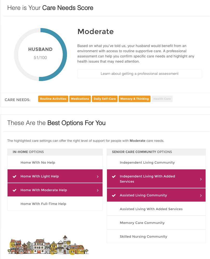
The Roobrik dashboard shown here displays care needs and settings based on data inputted by the user.
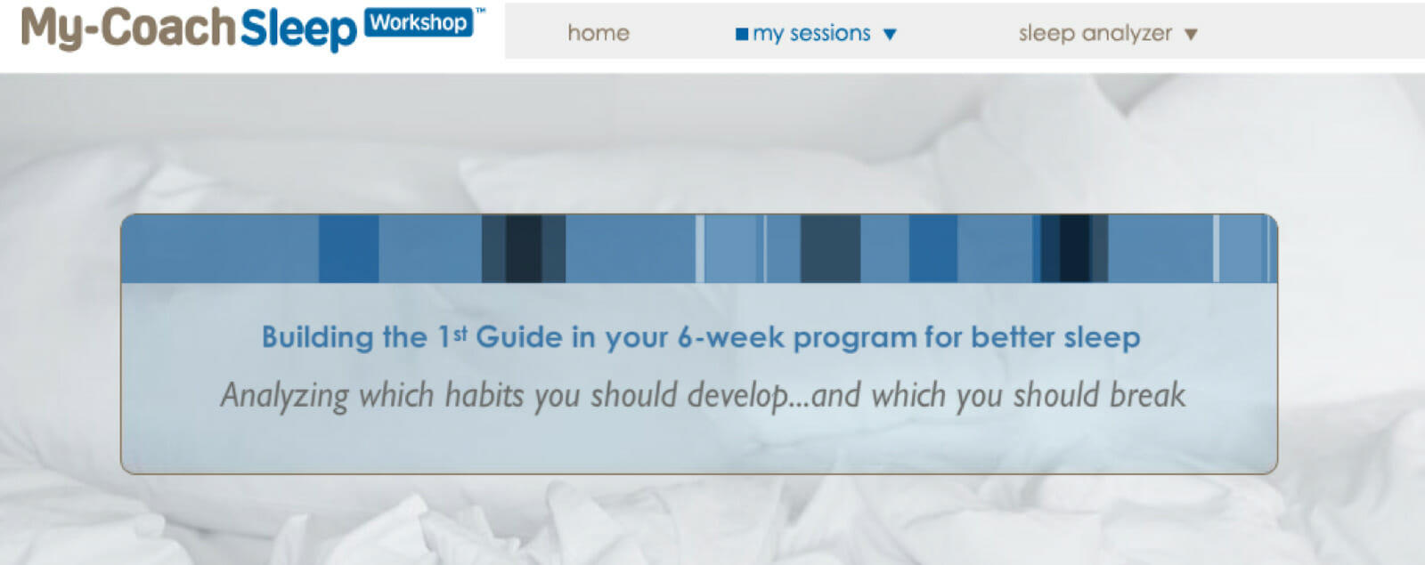
This screengrab shows one of the pages that users see when working through a six-week sleep improvement program through My-Coach Sleep Workshop.
Monitoring Progress
The next basic psychological need, competence, refers to people’s desire to see themselves progress along a course. People are highly attuned to evidence that their actions have had some effect on the world. They’re interested in activities where they can learn and grow (even if they don’t think of it in those terms). The designer’s toolkit for supporting this need includes creating effective feedback frameworks, and identifying ways to minimize or overcome obstacles to success.
High Quality Feedback
Feedback is how people know whether their actions are propelling them toward their goals or not. People are remarkably attuned to signals that indicate the effects of their actions. Designers can satiate this appetite for information by providing feedback at multiple levels to help guide users toward achieving goals. Immediate or proximal feedback occurs right after someone takes action. It lets them know if that action was successful, and suggests, either explicitly or implicitly, ways to improve if not. Cumulative feedback helps people see progress over time. It helps to communicate how many small actions add up into larger results. Pairing both types of feedback can help people stick with a behavior change where they might be expected to have setbacks or plateaus by reminding them of the bigger picture.
Normative feedback compares people to others to help them understand how they stack up against the field. It can be motivating to see that others are having similar experiences. Normative feedback can also help people adjust their performance based on what they see others doing. However, a pitfall with normative feedback is stacking people up who have significant differences. Someone just beginning a walking plan will lose a step count challenge against a marathon runner every time, and may incorrectly draw the conclusion that their efforts aren’t effective. That’s why programs like Strava (a workout tracking app) let people sort themselves into more meaningful comparison groups for providing this type of feedback.

Strava allows users to track their fitness progress as compared to others in order for them to more impactfully monitor their exercise goals.
Removing Roadblocks
Part of the research that goes into a behavior change design project is identifying anything that might make it hard for people to complete a behavior. Using frameworks like COM-B (capability, opportunity, motivation = behavior)⁴, designers look for barriers that can then be addressed with the design. There may be opportunities to coach users to avoid a barrier entirely, such as using canned goods as substitutes for weights in doing strength training. Sometimes education or training can help people grow their abilities beyond where they started, so what was once hard becomes attainable. Or there may be practical assistance that designers can provide their users; something like a museum guide helps visitors navigate exhibits and understand their relevance.
Another tactic to minimize roadblocks is to organize the steps toward reaching a goal so that they build on one another. This tactic, sometimes called scaffolding, helps ensure that people tackle each activity with the appropriate prerequisite skills. Duolingo, a language learning program, uses scaffolding to structure its lessons so that at any point, users are able to finish a lesson with their existing skills. Asking learners to self-identify whether they should start from the beginning or take a placement test further reduces any roadblocks that people might encounter to successfully completing the lessons.
Maintaining Contact
The last basic psychological need, relatedness, refers to people’s need to feel part of something larger than their own individual selves. Humans are the ultimate pack animal, seeking to feel a sense of community, whether by actually being together or in a more virtual sense by participating in online experiences or faith communities. Even people’s interest in astrology hints of community, feeling aligned with others born under similar stars. Designers can help people feel connected both by designing emotionally appealing products, and by offering people opportunities to support one another.
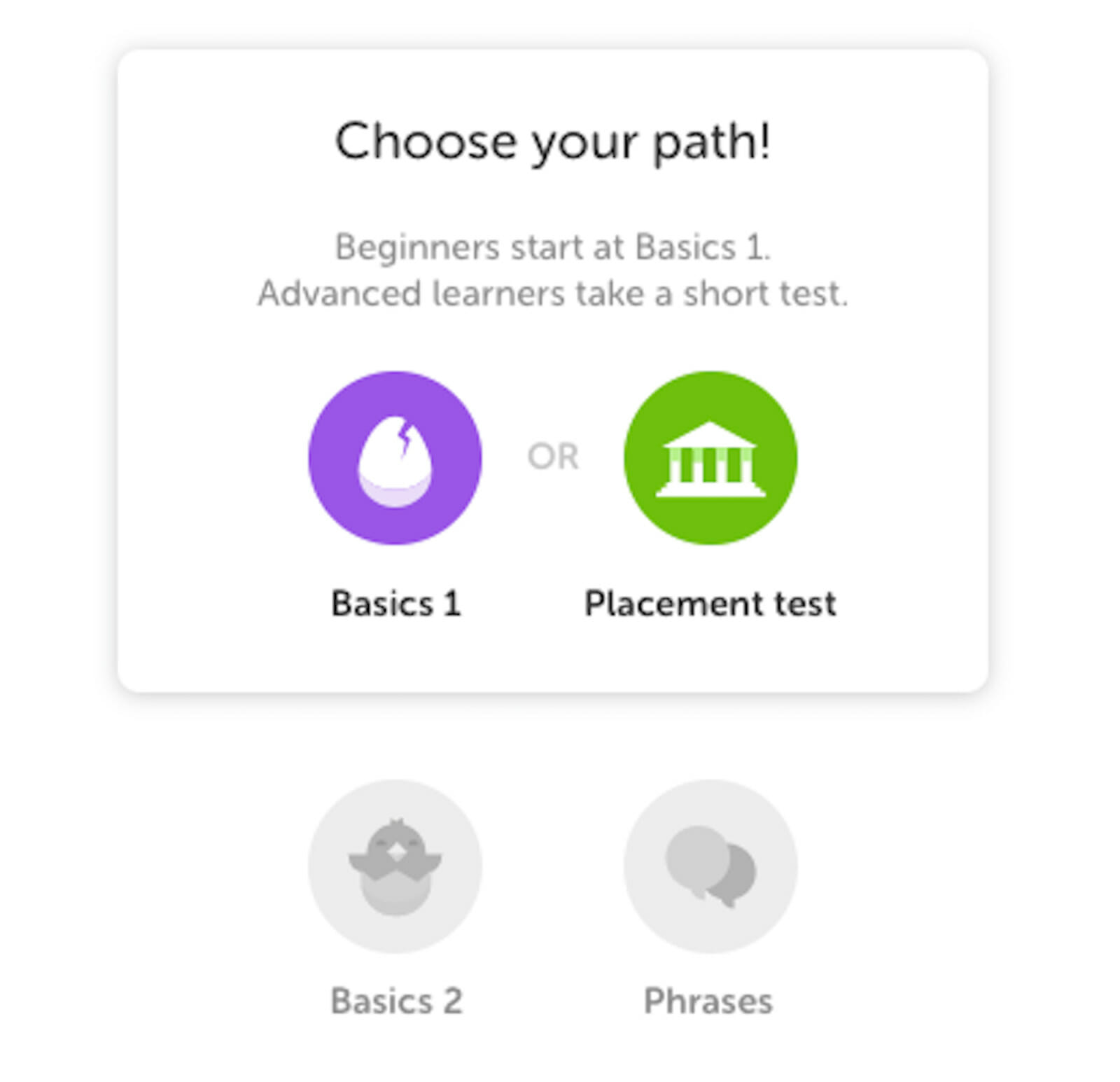
Duolingo allows users to choose a path for learning a language based off of their past experience with the language in order to maximize efficiency in their progress.
Technology for Connection
It’s not always feasible or desirable to have direct human support within a product or experience. In healthcare, there may be data privacy, regulatory, or practical considerations that make having a person available to talk to unfeasible. In fact, research suggests that in some cases, people may prefer to interact with a fully digital tool rather than talk to a person⁵, such as when they need to get help with an embarrassing or stigmatized health issue. Digital can also be the right choice for simple transactional interactions like appointment reminders. In a 2019 survey of UK National Health Service (NHS) patients, 76 percent liked the idea of automated reminders⁶. Finally, digital’s scalability makes it an attractive option to extend services geographically and over longer time periods. People can use a digital service 24/7 without live support needed.
The key is to design digital tools in a way that still fosters feelings of relatedness. Personalization, where information about the user triggers relevant content, can be an excellent tool to help people feel understood by technology. It doesn’t have to be creepy; designers can be forthright about how user data is fed into the product to produce personalized outputs. Some of the digital health coaching products I worked on earlier in my career included what we called a “magic moment” transition between when users answered questions about themselves and when we created their personalized output. The magic moment explicitly called out some of the factors we were incorporating into the personalization. We found that including it increased our users’ confidence that the coaching they received from the product was relevant, which in turn made them more willing to engage with it.
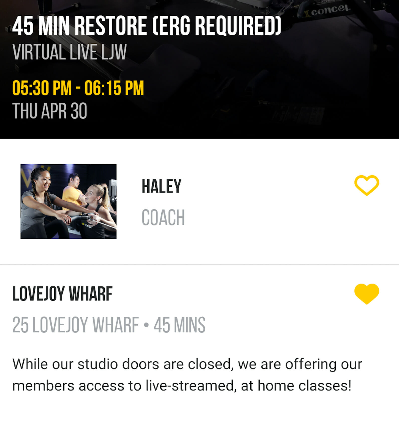
Row House is one example of a company that has branched out into at-home fitness through providing users with an app interface to view and participate in classes, as shown here.
Bringing People Together
As much as technology can provide support, sometimes there is no substitute for another human being. People can support each other in a variety of ways, whether it’s by helping with a task, providing knowledge or coaching, being an accountability buddy, or just providing friendship and caring.
Designers can include mechanisms for their users to receive expert support. Telehealth is a paramount example, where the core of the experience is interacting with a healthcare professional. Other examples could include enabling social media sharing within an app, crowdsourcing information about how to navigate a challenge, or creating team competitions. With the shift to stay-at-home lifestyles during COVID-19, some companies have brought their in-person services online, such as Row House, an indoor rowing gym now offering virtual live classes.
Behavior Change Design Is Not About Designers
All of the tactics shared here are in the interest of creating alignment between what you, the designer, hope to have your users do, and the goals and values your users bring to the experience. Fortunately, for many designers, there truly is a meaningful overlap between what their designs offer and what most users want to do. Designers may want to reduce healthcare expenditures while users want to feel better when they wake up in the morning; the same set of activities can achieve both.
Talking to users early in the design process is an important step in uncovering where these alignments exist and developing the language to make them apparent. Anyone working as a designer has some expertise in their problem area. That can make it hard to remember what it’s like encountering the topic for the first time, with little experience or pre-existing knowledge. There is no substitute for hearing from people firsthand what their experience with the design area is and using that as input to the design. Co-designing with members of your target audience offers an even more powerful way to incorporate insights from users into whatever you create.
Ultimately, behavior change design is about the user, not the designer. If your products, services, or experiences aren’t built to support what really matters to the people who use them, they will not engage.
