UnitedHealth Group and Optum Emphasize the Care in Healthcare
As with virtually every other aspect of our lives, technology has revolutionized healthcare. Over the past decade, patients and healthcare providers began to interact through online and mobile devices.
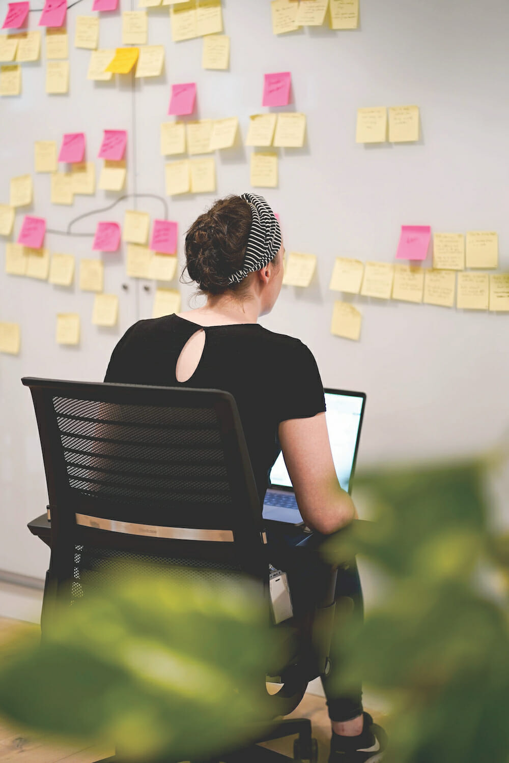
Participants in the ideation workshop used Post-It™ notes to write down their ideas on “How might we improve the user’s experience?” They grouped the ideas, identifying key areas of focus for the solutions. Images courtesy of Optum.
By Jen Shaffer, Director of User Experience, Optum and Thomas DiJulio, Senior Content Strategist, Optum
The COVID-19 pandemic has accelerated that trend, advancing alternative forms of care delivery, such as telemedicine and patient portals. While some healthcare companies have struggled to transition, others have embraced the opportunity to innovate and have discovered that designing digital healthcare solutions is less about technology and more about people.
As the largest healthcare company in the world, UnitedHealth Group’s mission is to help people live healthier lives and help make the health system work better for everyone. UnitedHealth Group operates two distinct businesses: UnitedHealthcare and Optum. In the United States, UnitedHealthcare offers the full spectrum of health benefit programs for individuals, employers, and Medicare and Medicaid beneficiaries. Optum delivers information and technology- enabled health services to drive healthcare innovations and improve overall population health. Operating at the intersection of technology and healthcare, Optum has long prioritized digital design. More specifically, human-centered design.
Optum & UnitedHealthcare in Action
It’s a sunny summer morning in Kansas, before the global COVID-19 pandemic, and Rain Higgins is already having an unusual day. She is sitting in an orange folding chair on the green lawn of a rural home, her laptop perched precariously on her knees. Rain, a UnitedHealthcare case manager, is conducting an in-home assessment with a client. Jen Shaffer, director of user experience for Optum, is observing the visit. Assessments are made every six months to determine the client’s health status and ensure they’re getting the services and care they need for their Medicaid program. As the name implies, the assessment normally takes place in the home. However, the client is reluctant to let them inside due a bed bug infestation. Determined to help the client in this unique situation, Rain conducts the assessment al fresco.
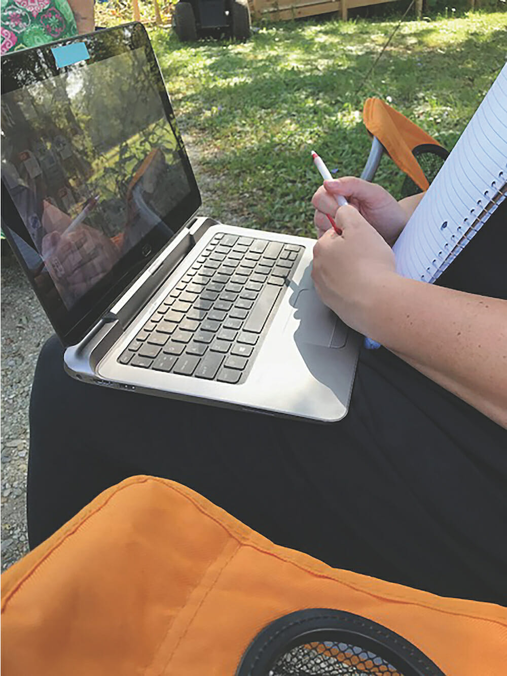
Case manager Rain Higgins conducting an in-home assessment outside of the client’s home.
Empathy in Technology
To better understand how she found herself on a lawn in Kansas, it helps to know what Jen does. As a user experience director with Optum’s User Experience Design Studio (UXDS), Jen is part of a 150-person team specializing in a human-centered approach to research, design and development of digital products. In her efforts to better understand clients and their needs, she sometimes shadows healthcare partners working in their day-to-day environments.
A UnitedHealthcare line of business focused on community care asked UXDS to identify opportunities for case managers to be more efficient in documenting client assessments. To accomplish this goal, Jen suggested they observe case managers on visits. “After seeing what case managers and their clients wanted and needed, it was obvious that this wasn’t just about the technology itself. It was about understanding the visit and interactions, which led to addressing some very human challenges,” Jen recalls.
Learning Directly from Users
Over the next few weeks, Jen and her team conducted additional research, observing eight case managers in Kansas, Florida, and Arizona. Her immediate insight: “Sometimes technology needs to take a back seat.” Building rapport is a key factor in building trust with the client and/or their caregiver. “If the case manager is fixated on their laptop or struggling with a hot spot connection,” she observed, “they’re not making eye contact; they’re not having the crucial conversations that lead to understanding the client’s current state and needs.” Technology, despite its strengths, can also be a barrier to human conversation and insights into the client’s health.
Jen recalls that the lawn chair assessment, while a bit unconventional, proved to be invaluable. While Rain conducted the assessment, balancing her laptop on her knees and writing notes on paper, it was hard to read the screen in the sunlight. As she later explained, Rain knew the assessment by heart, so it was easier to rely on memory to ask necessary questions and note the answers by hand. She would enter those notes and complete the assessment after hours to help ensure the client continued receiving necessary healthcare support and services. In this situation, the technology wasn’t making things easy. Quite the opposite: it made Rain’s day longer and her job harder, because it wasn’t developed with a complete understanding of her needs. The software centered on a solution to a technical problem—entering client information during a visit—but it did not address the needs of the person using it, or how it would impact the relationship with the client.
The following day, Jen observed another case manager, Courtney Davis. Together, they visited a young man living with his mother, who was paid by the community care program to be her son’s caregiver. The visit began cordially, but as Courtney asked questions to complete the assessment, the mother started to voice frustration with the program and its reimbursement policies. As her frustrations rose, so did the volume of her voice. At that point, Courtney spoke calming words to deescalate the situation, closing her laptop, so she and Jen could leave quickly after saying their goodbyes. While case managers are trained in how to handle difficult situations, it became apparent that the software offered no allowance for quick departures which can result in the loss of difficult-to-gather client details. Fortunately, these situations are rare, but they impact both case managers and clients, and they are situations Jen and her team would not have understood without observing case managers like Rain and Courtney.
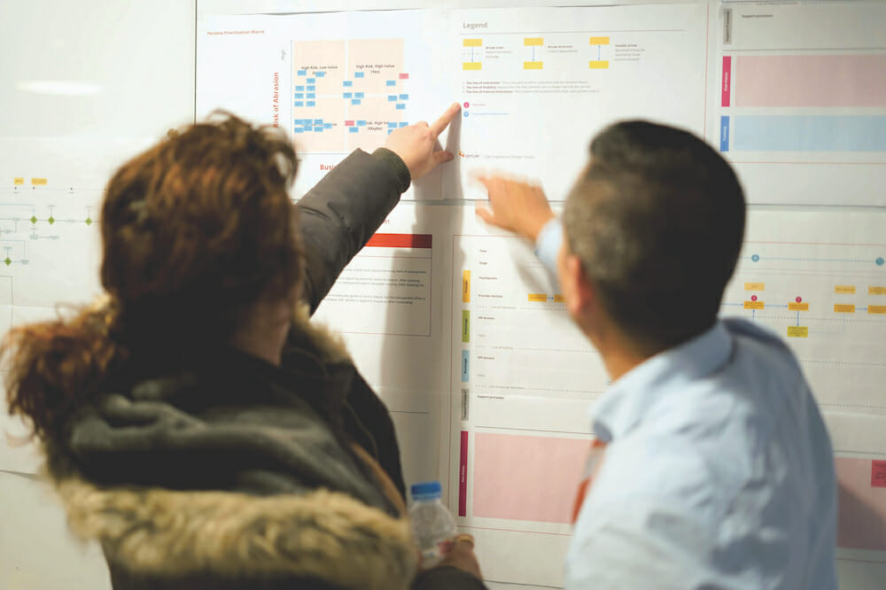
Through its human-centered approach, UXDS is firmly committed to using design to drive innovative healthcare solutions—one human at a time.
Journey Mapping, Blueprinting and Workshopping a Solution
Case manager research complete, Jen and her team returned to the office and rolled up their sleeves. Their first task was to create a user persona—a fictional character representing the user—to represent the case manager. The persona provided a shared vision of the user to the project team, helping them understand and empathize with the user’s needs. They named their user persona Melissa. Using information gathered during the observations, Jen’s team then created a journey map—a visual timeline of the user’s process. The map outlined activities that Melissa completed in her home office and during client visits, along with critical pain points. Lastly, they created a service blueprint, identifying touchpoints for the client, to provide the team with critical information around the community care program experience.
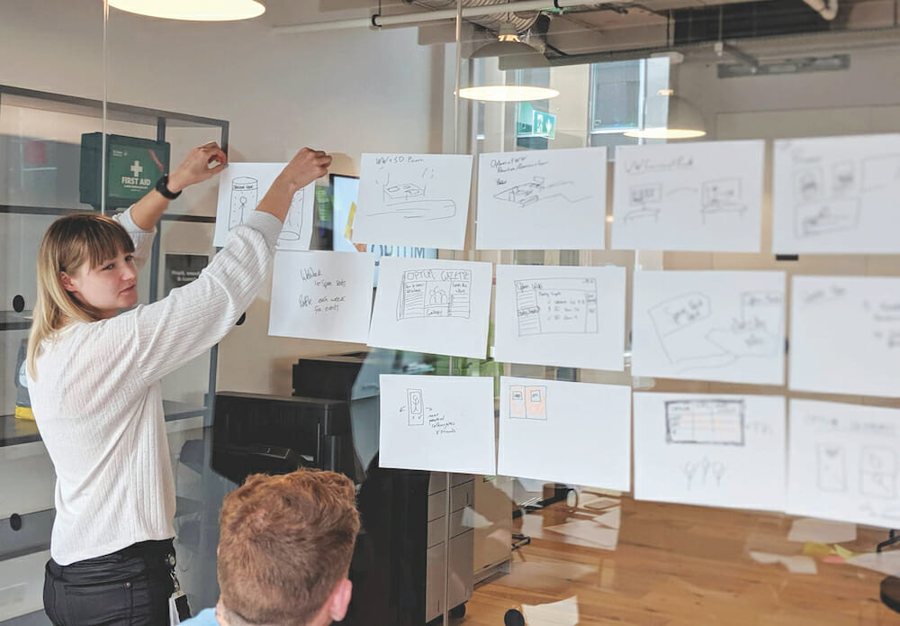
With the user persona, journey map, and service blueprint in hand, Jen facilitated a two-day ideation workshop with participants representing the community care program, case managers and Optum Technology. Participants were introduced to Melissa, the user persona, and asked, “What would Melissa hire you to do?” Using this approach, they identified key categories of focus. The next activity involved asking the question, “How might we improve Melissa’s experience with our software?” This generated a full wall of sticky note ideas. Participants sketched out those ideas in teams, giving everyone an opportunity to contribute to solving Melissa’s challenges.
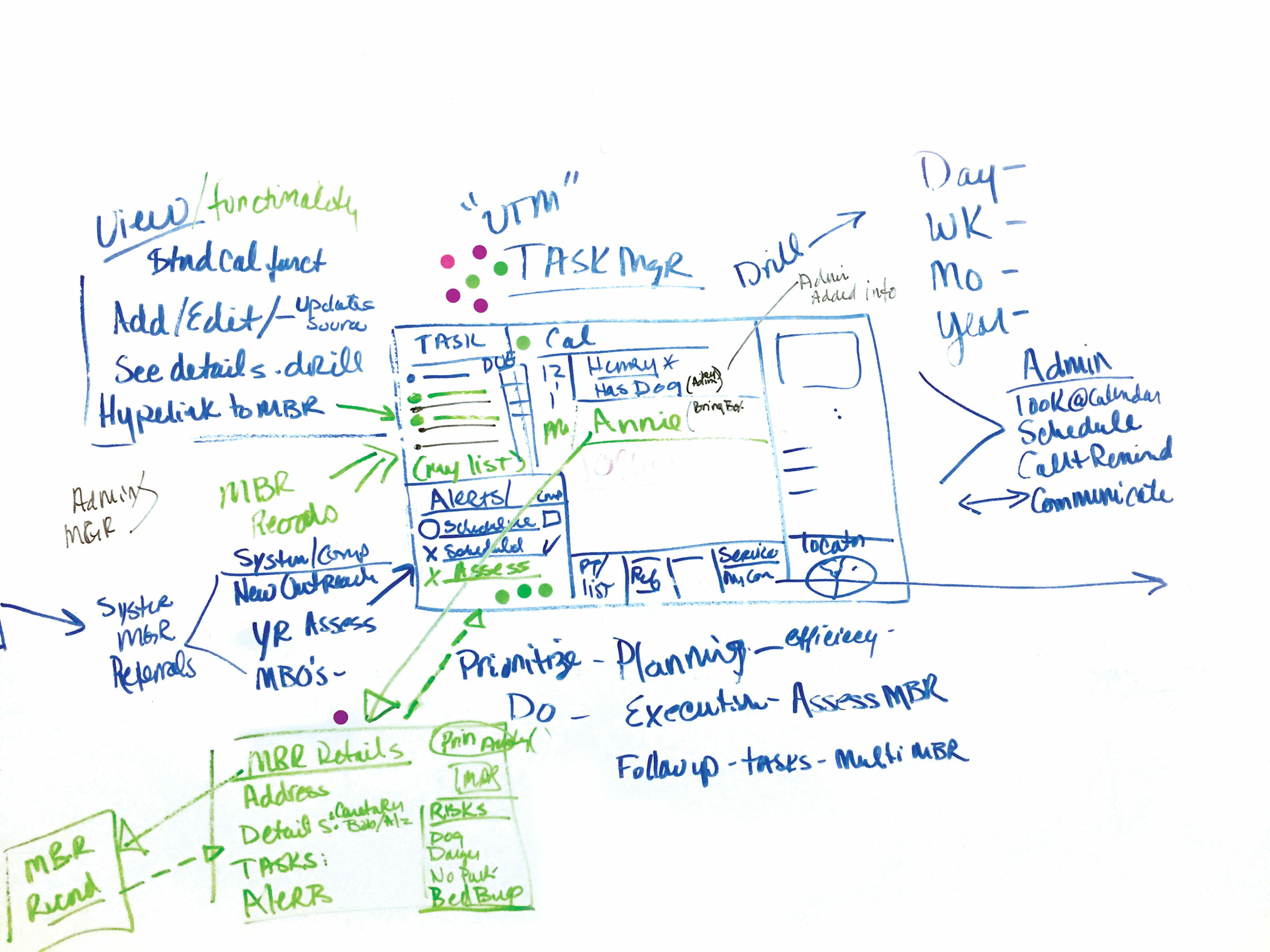
At the workshop’s end, they had three concepts: a case manager dashboard, an enhanced client page, and a mobile companion app. The dashboard would provide case managers with vital information: a visit map, client list, calendar, and key notifications. The enhanced client page was optimized for the case managers’ needs, providing crucial details such as allergies and medications all in one screen. Lastly, the mobile app made it easy for case managers to map routes, access calendars, capture notes, track mileage, and receive alerts.
Putting Usability to the Test
UXDS built prototypes for all three concepts and conducted three rounds of user research with case managers from multiple state health plans. The research gathered design feedback and measured the quality of the concepts, giving the team a chance to iterate between tests. The team also ran tests that compared the current software to the prototypes, gathering Net Promoter Scores (NPS) and System Usability Scale (SUS) scores. Both are industry- standard techniques: NPS measures customer loyalty to a product, and SUS measures perceived usability. The results? The prototypes exceeded both the NPS and SUS benchmarks. But most impressively, due to time-on-task testing, the team concluded that one state alone could save $1.6M a year in productivity. If applied to all states offering the community care program, the potential savings were immense, even when accounting for implementation costs.
The original rollout of the client management software incorporated input from employees of the state health plans. However, it was only when UXDS observed case managers on visits that they fully realized the challenges the case managers faced. Case managers need to handle unexpected situations, while providing dedicated support to their clients to help meet their health needs and documenting their work digitally. While project teams can determine technical requirements with a group of experts, user research gives the team user empathy and a shared understanding of what they encounter daily. These insights make the work human centered.
Small teams of workshop participants sketched out ideas identified in the “How might we…” exercise. After each team presented their solutions, participants used dot stickers to vote on features.
Designing End-to-End Experience, Through Service Design
To bring empathy to their design process, UXDS uses service design. As defined by the UK Design Council, “Service design is all about making the service you deliver useful, usable, efficient, effective, and desirable.” Teams are better able to understand what users want and need by observing and listening to them firsthand.
For an organization to design an experience that meets or exceeds the expectations of its users, it must understand what those expectations are. The first priority is to conduct research in order to connect with users’ needs. From there, the focus is on the journey.
Any journey is made up of different steps. Every step impacts user satisfaction. For example, a coffee shop’s mobile app that lets you order in advance, or a doctor’s office that allows you to schedule online are touchpoints aligned with expectations and needs. But if there’s a wait to pick up your coffee, or you can’t easily get the appointment you want, customer satisfaction is equally impacted.
Typically, businesses concentrate on touchpoints they can control, which makes sense. Service designers strive to broaden focus and look at every step—even those steps that can’t be controlled—to create a satisfying experience from beginning to end.
It’s no different in healthcare. Using service design is imperative to understanding the expectations and needs of all involved in the health system: patients, caregivers, healthcare providers, health plans and others. “Service design enables organizations to understand the real needs and pain points of users and all other involved people. With this knowledge, teams can effectively improve existing healthcare products and innovate meaningful new offerings,” says Marc Stickdorn, author of This is Service Design Thinking and This is Service Design Doing.
By incorporating service design, teams can design the experience around the humans using it and those delivering it, resulting in a useful and effective experience for the user. And if the user is delighted, Net Promoter Scores increase, there’s greater customer loyalty, and so on. In other words, service design is the difference between those experiences that users choose repeatedly, and those they don’t.

The design team observed users, and then used the data gathered to create a persona to provide a shared vision of the user and their needs.
UXDS team members used Service Design methodologies to create journey maps, which are a visual timeline of the user’s process, and a service blueprint, which identifies all touchpoints within the experience.
Why Empathy is Even More Important Now
Think about how you use technology and its terminology daily. Now think about how your parents or grandparents use technology. Are they using the same language? Would they be able to log into a patient portal, set up audio and video, and be on time for a virtual doctor visit without assistance? Further, according to the Centers for Disease Control and Prevention in 2015, one in five persons in the U.S. has a disability, which might be cognitive, visual, auditory, or related to dexterity. Without careful planning and consideration, you could potentially exclude up to 66 million Americans from using your product or service. Human-centered design takes commitment, time, and investment, but the payoff of providing a useful, efficient, and effective experience for your user is immeasurable.
It’s not uncommon for designers and programmers to assume they know what users want. But not at Optum, where UXDS designers, researchers, and accessibility specialists wear T-shirts that read “Ask me about usability,” and monthly webinars are presented to the enterprise on user-centered topics. The design mentality is that the team may understand the technology, but the team must also understand the user. A point that hit home for Jen, whose 78-year-old father was diagnosed with Type 2 diabetes shortly before the COVID- 19 pandemic began. She says, “If he had complications and needed assistance with this new diagnosis, I doubt he would have been able to navigate a virtual doctor visit alone. He’s still trying to master submitting his taxes online.”
She also mentions a colleague within UXDS, Mario, who is blind and has young children. Mario wants to independently manage his children’s health needs digitally through portals. He wants to access their insurance cards electronically, rather than having to ask his children for help when they’re checking in at a doctor’s office. “Are the digital technologies Mario’s using fully accessible? Are they being built with a 78-year-old diabetic in mind?” Jen asks. If designers are not using human-centered design to understand and empathize with all users, they’re leaving a significant number of people behind. Technology has changed healthcare significantly in recent years, but without the human perspective, it’s just a device or a screen. It’s not an inclusive experience, which could keep patients from receiving the care they need.
Doing is the Hard Part
By taking a human-centered design approach to projects, UXDS brings awareness of the user’s desires and frustrations to the project team. When a team can empathize with the user to ensure patients’ healthcare needs are met, the result is better outcomes for the organization and most importantly, the people they serve. Dean Barker, vice president of UXDS, continually preaches the gospel of human-centered design across UnitedHealth Group. “Design can drive healthcare solutions,” Dean declares, “but only when that design is based on understanding and empathizing with users.” He points out that design never sleeps and must be continually evolved, evaluated, and emphasized. Simply understanding the theory is not enough. It must be put into practice. He believes, “It’s a journey.” As Marc Stickdorn points out, “When it comes to sustainably embedding service design in an organization, it’s not a sprint, it’s a marathon.” Dean, Jen, and the team at Optum UXDS are committed to running that marathon every day. Even those days when they find themselves not running at all but sitting in an orange folding chair on a green lawn on a sunny day.
