Enhancing Learning Spaces with Environmental Graphics
Creating Memorable Spaces
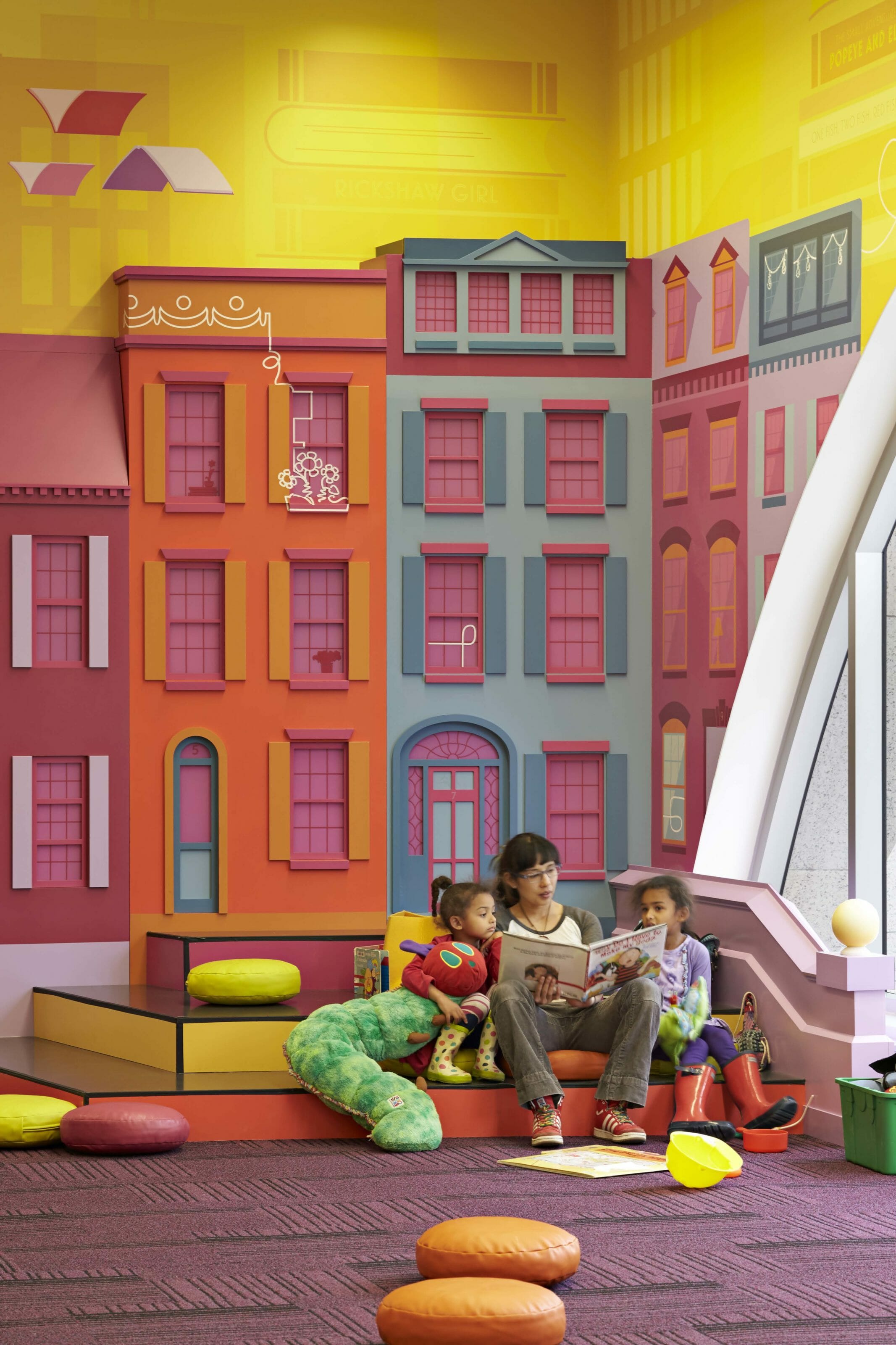
Photo by Robert Benson
By Lauren Haggerty
“Hello friends!” greets a staff librarian with a warm smile, as young visitors and their caregivers enter the Children’s Library of the Boston Public Library Central Library in Copley Square. The room is busy with a mix of regulars nestled into their favorite spots and first-time visitors taking in the bright colors and welcoming environment.
Six years ago, we, the designers from the Arrowstreet Graphic Design Studio, developed the custom graphics that surround the room, and we are here to learn more about the impact they have on visitors. We are eager to talk with children and their caregivers about their favorite aspects of the room, why they visit, what makes them come back, and how their experiences here differ from other libraries.
Our work integrating environmental graphics in civic and educational spaces has proven to be an incredible tool to enhance spaces. They can set the tone of a space, integrate an institution’s culture into the fabric of the building, or influence the mood of visitors and students, resulting in more profound connections between people and places. More and more libraries and schools are using graphics to increase engagement, offer surprising learning opportunities, rein-force values, and highlight building features.
Creating Memorable Spaces that Reflect the Community
The Boston Public Library’s Children’s Library of today is a stark contrast to its predecessor, which was small, cluttered, and lacking views to the outside. As Michael Colford, Director of Library Services, is quoted, “What was here before this renovation was what was there in 1972. The carpet was the same carpet. We had brown panels. We had gray granite…There was never any color…Our children’s room was really substandard for a library this size.”
BPL leadership wanted to ensure the space reflected its urban location with Boston-specific elements and landmarks. It had to appeal to both children and adults, sparking imaginations with bold colors and confident gestures. The graphics also needed to blend the theme of “Read, Play, Learn” while conveying travel, movement, and progression. Put more simply, they wanted “wow factor.”
The overall design of the Children’s Library was led by William Rawn Associates (WRA), and the layout included five distinct zones: Early Literacy, StoryScape, Collections, a Program Room, and a space dedicated for tweens. Bold lines referencing Boston’s metro system welcome visitors at the entrance and guide them to the five zones, each featuring a different color. Custom illustrations depicting areas of the city combine with elements of reading, playing, and learning to create visually distinctive areas under one cohesive theme.
The resulting design announces itself before reaching the door with a vibrant presence that can be seen from across the atrium. Upon entry, visitors are surrounded by original illustrations comprising five “chapters,” which tell a story of three lion cubs—the Children’s Library mascots—and their adventures in Boston. The youngest library users play along-side the famous ducklings, frogs, and swan boats of the Public Garden. Child-size town-houses create StoryScape, where children can gather for story time. Stacks of books featuring titles by local authors create the Boston skyline and provide a backdrop to the circulating collections. Curious George greets visitors at the entrance to the Margret and H.A. Rey Program Room while fishing in Boston Harbor. The story culminates with a mural featuring the Zakim Bridge, a metaphor for tweens’ transition to Teen Central on the opposite side of the floor. Each chapter is tied together with a single white line, which originates from an open book near the room’s entrance and weaves its way around the room depicting the lions’ journey through the city.
By utilizing local landmarks, an immediate connection is created between visitors and the space. By reimagining these familiar sites in a fantastical way—where books become recognizable bridges and buildings, and frogs from the Boston Common Frog Pond relax with a book under a tree—a memorable space is created for visitors of all ages.
Fostering Learning and Infusing Education
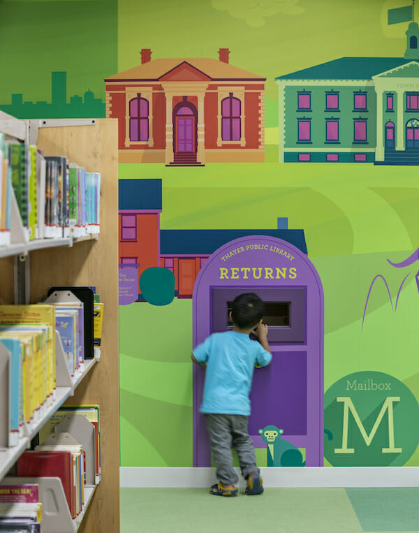
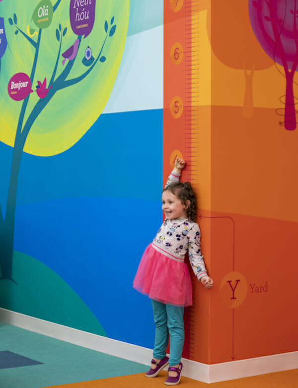
Environmental graphics also provide opportunities to utilize the physical space as an educational tool. This approach played an import-ant role for the Children’s Room at Thayer Public Library in Braintree, Massachusetts. This well-loved but well-worn section of the library needed updating to accommodate growing demands, expanded programming, and new technology. The library wanted a vibrant, interactive, and inviting space infused with playful moments of discovery and education.
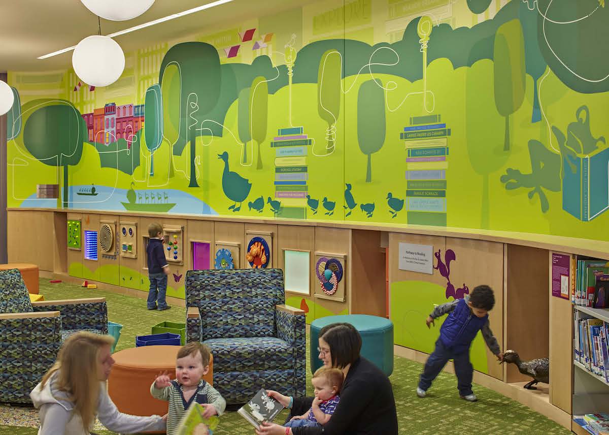
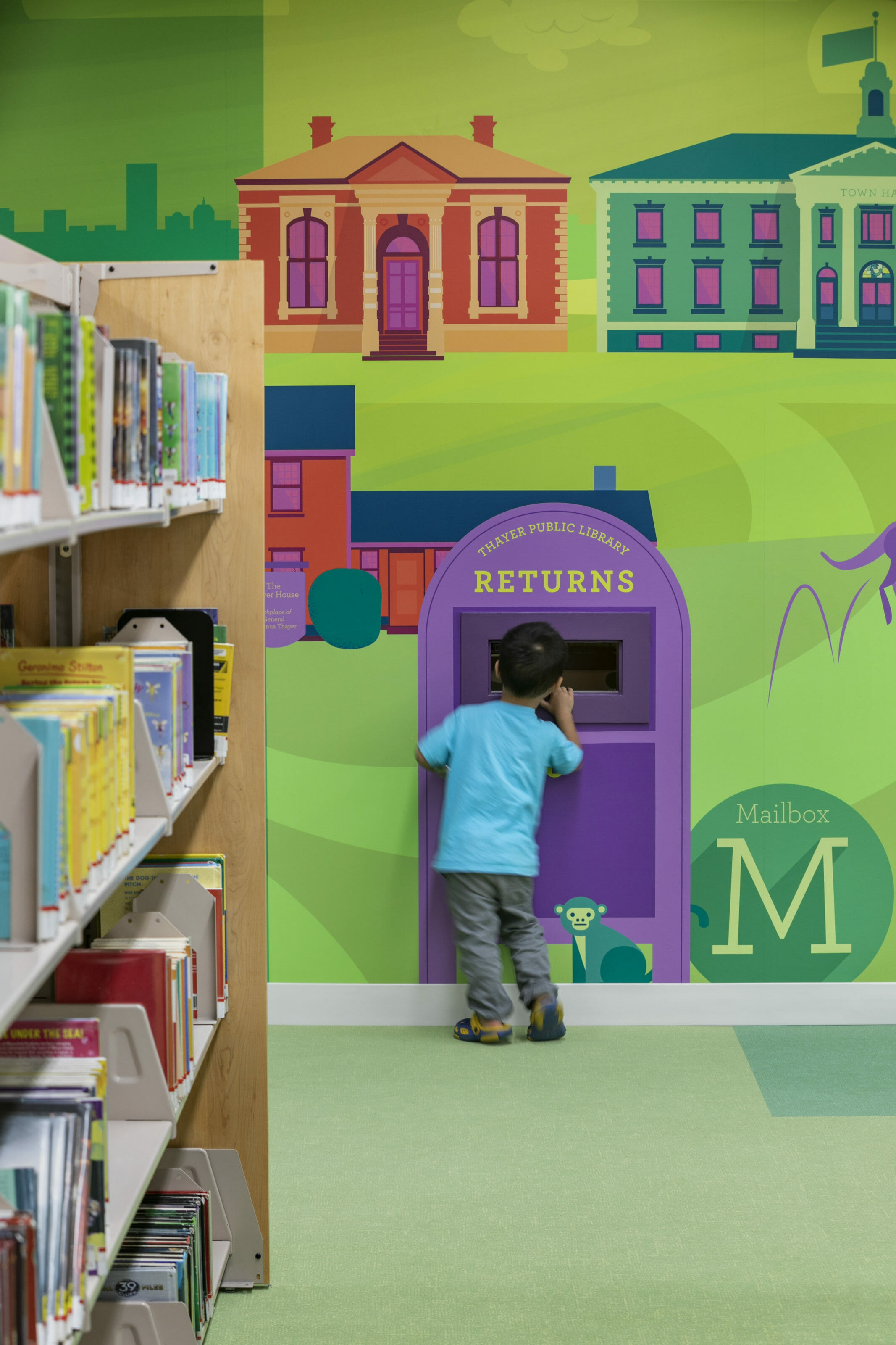
Patrons entering the space are greeted by a mural with a friendly “hello” accompanied by hellos in the most predominant languages spoken within the community. The greetings are spoken by friendly animals nestled within the tree anchoring the circulation desk. These greetings not only celebrate community culture, but also provide an educational opportu-nity by introducing other languages. Spanning the entire length of the room, a 111-foot-long custom mural combines local landmarks and history with age-appropriate learning elements. Numbers and shapes are combined with friendly characters in the Young Readers area. Children learn about measurement and track their growth on a height chart. Local, historical homes are nestled amongst the bookshelves and cleverly integrate a geometry lesson. Designed as a scavenger hunt, each letter of the alphabet is woven throughout the mural, sparking a sense of curiosity, discovery, and accomplishment for children of all ages. The result is a rich and engaging experience that inspires visitors to explore, play, and make learning fun. Reinforcing Values An institution’s values, history, and culture are central to its identity, and environmental graphics can be used to communicate those messages, particularly in schools. By celebrating the qualities that make each school unique, students are reminded every day of the role they play in the school’s history and culture. Blackstone Valley Prep (BVP) in Cumberland, Rhode Island did just that. BVP students are referred to as “scholars,” and the graphics we created for the school needed to reflect the same level of maturity. BVP staff members encourage the scholars to be positive and forward-think-ing, and the school understands how color and environmental graphics can affect their mood, outlook, and attitude, while establishing a creative and inspiring school environment. To develop the environmental graphic concept, we turned to BVP’s own culture and values for inspiration. Their core set of principles—Perseverance, Respect, Integrity, Discipline, and Enthusiasm—became bold, typographic accent walls with the acronym P.R.I.D.E. in large letters. Each of the letters uses a different typeface to celebrate BVP’s diverse population and is paired with quotes chosen by members of the community. Bright colors were selected to work with the school’s existing colors—blue and yellow—and provide contrast to the neutral palette of the architectural finishes. The graphics are strategically placed throughout the school to inspire and encourage staff and scholars each day. As one student commented, “Everything felt better, like it was a new beginning.” When entering BVP, you are greeted with the school’s mission statement and individual photos of each of the scholars; acting as a daily reminder of the important role they play in their community.
Celebrating Sustainable Efforts
With the increasing emphasis on sustainability, institutions are looking for more ways to minimize their carbon footprint. This was true for the King Open/Cambridge Street Upper School & Community Complex (KOCSUS) in Cambridge, Massachusetts. Designed as the first Net Zero Emissions and first LEED v4 Platinum school in Massachusetts, the building uses 43% less energy than a typical Massachusetts school and 70% less than the average school in the United States. KOCSUS establishes a new standard for education design and high-performing buildings by creating a 21st-century learning lab. Environmental graphics were used to increase students’ awareness of the role they play in the health of the planet. Large graphics placed in corridors and common areas educate students on the building’s sustainable features and how they can make environmentally-conscious contributions to their community. The illustrations break down complex sustainable design elements into easily understood concepts, such as water and electricity conservation, photo-voltaic science, insulation, recycling and com-posting, geothermal heating, and daylighting. Presenting the information in the form of bold and playful graphics helps students and visitors understand these complex concepts more easily and encourages behaviors that will help the school achieve their energy goals.

The Results
Not only can environmental graphics excite, educate, and inspire, but they can also help promote growth in visitorship, programming, and circulation. At the BPL Children’s Library, pro-gram statistics grew significantly in the years after the renovation. From 2014 (pre-renovation) to 2018, BPL increased programming by 420% and saw an increase in attendance of 250%. Of the people surveyed, 70% said they visit at least once a week, with 81% saying the interior design of the space impacts their deci-sion to spend time there. As one of the regular visitors states, “We feel free here, like it’s our own living room.” Many of the parents and caregivers we spoke to pass by their local library and make a longer trip to the Central Library. They feel the BPL Children’s Library’s pro-grams, activities, natural light, amenities, and overall environment make the trip worth it. David Leonard, President of the BPL, explained, “While much of the focus of effort and budget was on architectural transformation, the visual transformation represented by the graphic work is some of the most impactful and memorable.” Environmental graphics do, in fact, have an impact with a high return on investment. While libraries and schools are often mindful of budget, many are unaware of how a little money can go a long way. The cost to develop environmental graphics, comes in two parts: the cost to design the graph-ics, and the cost for production and installation. In general, the production and installation costs comprise a small percentage of the overall construction budget. The over-all production costs for both BPL Children’s Library and BVP were 0.6% of the overall construction costs. As for the design of graphics, costs can vary depending on the content, with highly illustrative solutions being more expensive than simpler color and/or type-based graphics. However, by clearly communicating and establishing budget expectations early, effective environmental graphics can be produced to fit most budgets. Jeremy Chiappetta, Chief Executive Officer of BVP, learned just how impactful and cost-effective graphics can be. “One of the biggest surprises to me…was the incredible impact graphics provide relative to the costs,” he said. “When people visit BVP High School, they immediately comment on the [graphics]. Rarely do I get comments or even questions about elements of the facility that are probably far more expensive [such as] flooring choices and HVAC systems. I would argue while one might be tempted to value-engineer graphics out of a project, it’s likely your biggest return on investment.”


Always Room for Improvement
Back at the BPL Children’s Library, we’ve enjoyed our time speaking with the librarians and patrons who have helped provide further insight into the impact of environmental graphics. In contrast to the energetic group of children in the room, an 8-year-old girl sits quietly reading a book in her favorite corner. When asked if there is anything she would change about the space, she thinks and says, “Hmm, more unicorns.” We let her know we’ll keep that in mind for the next project.
The environmental graphics showcased in these case studies were designed by the graphic design studio at Arrowstreet, an architecture and design firm in downtown Boston. The studio specializes in signage, wayfinding, and environmental graphics. Interviews, observations, and data were collected in 2019, prior to the COVID-19 pandemic.
